
I Got You
And how creative constraints can be your friend

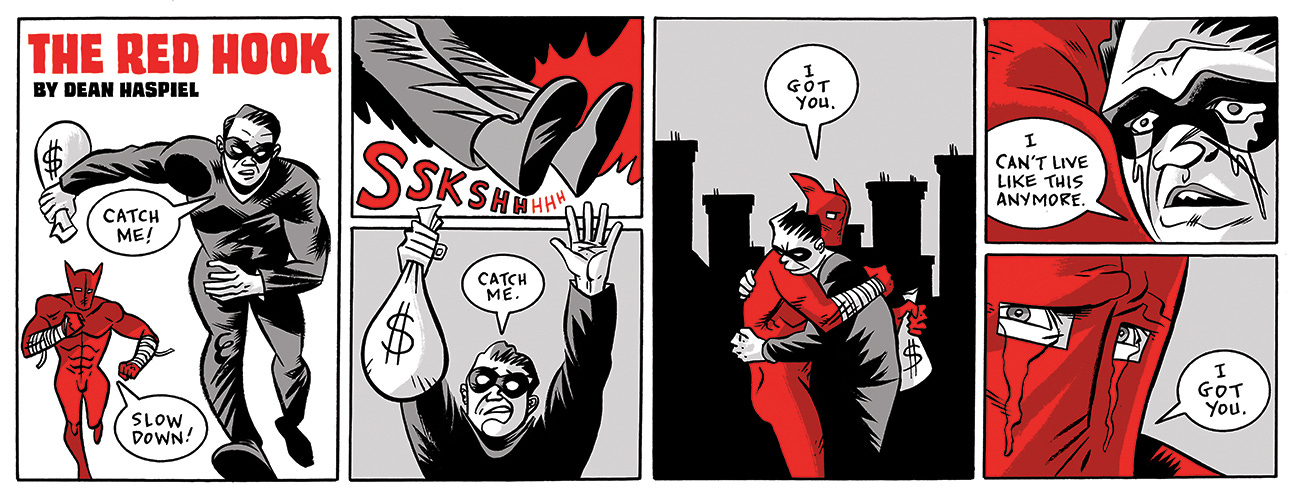
For local folks in my neck of Brooklyn and The Village in Manhattan, I’ve been producing a monthly Red Hook comix strip (and curating a “Comix Block”) for The Star-Revue. In order to present The Red Hook as both a comix strip and a traditional comic book page, I figured out a way to do both by applying the logic of math. It involves a split in the middle but I’ve found ways to work with that constraint.
In fact, constraints are one of my favorite ways to create. When I produced two seasons of Billy Dogma for ACT-I-VATE, the free webcomics collective I sparked and co-founded in 2006 (RIP), I employed the constraint of square panels. It was ACT-I-VATE co-founder Dan Goldman who figured most folks would read it on their flip phones one square panel at a time (clicking next or swiping left). This was before smart phones and tablets adapted their screens to books and comic books, etc.
No longer able to exploit the narrative gold of a blank page, I only had the dimensions of a square to show a close-up or a vista or a different point of view. It was an eye-opening yet sometimes aggravating challenge. But I made it work. When I eventually publish a Billy Dogma omnibus, I’ll probably redesign those two seasons (“Immortal” and “Fear, My Dear”) to be six panels per page.
When I produced 4.5 seasons of my Ringo Award winning series, The Red Hook, for Webtoon, I had to deliver each chapter as a vertical scroll (like reading a comic on a roll of toilet paper). But I knew I would eventually publish the stories in traditional print format. So I drew each chapter like a regular comic book while considering how to cut it up for the vertical scroll. Which meant I had to abandon landscape panels and inset panels for tall panels. I had to think in terms of up and down instead of left to right. A narrative reveal at the bottom of a scroll rather than turning a page.
I had to letter it one way for Webtoon and then the traditional way for print. I produced over 600 pages like that. Designing the same comic for two very different formats. I aim to publish a Red Hook omnibus that collects all 4.5 seasons of the “New Brooklyn” saga and much more (TBD).
Bottom line, creative constraints can hinder or enhance your ability to experiment depending on your willingness to play. I’ve been asked to write a 20 page comic book script only to be told (after I handed in the script) that I only had 12 pages to draw it. A constraint after the fact but I managed to make it work. Someone asks me to write a one-act play in 55-pages or under (approximately an hour of stage time) and I do it. Embrace perimeters and you’ll likely surprise yourself.
Meanwhile…
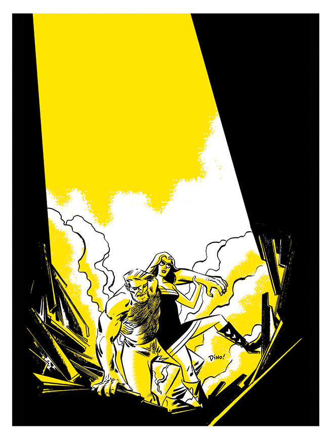
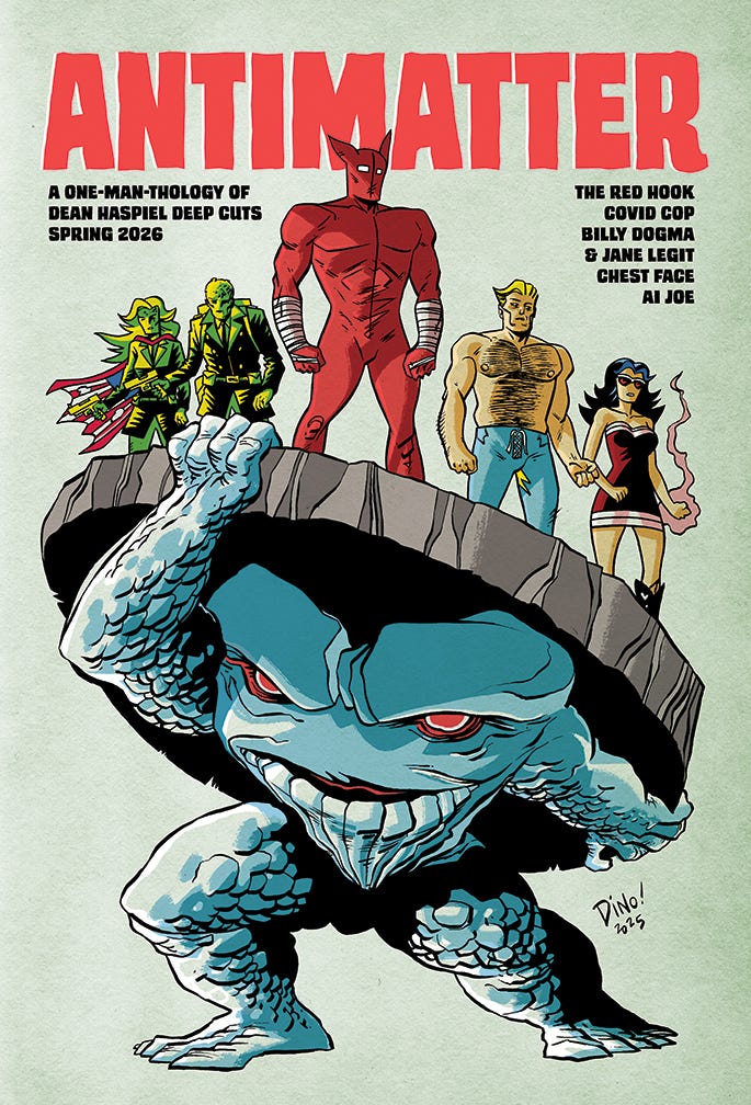
ANTIMATTER is my upcoming one-man anthology featuring my pantheon of protagonists and paramours — where you’ll be able to snag that sexy Billy Dogma + Jane Legit print (seen above), and read my new Red Hook comix — plus much more! Check out the campaign HERE to learn more before it ends on Nov 3rd, 2025.
See you in the gutters—
—Dean
Instagram / Etsy / VITO x DINO
The thing about square panels is that once you place the text at the top it becomes more of a landscape ratio, I find. I consciously hewed to a six-panel (square panels) grid in the late 1980s just to get my storytelling under control. Too much Sterankoid shattered-glass page layouts becomes confusing and a waste of time to design properly. I found that by concentrating on what went into each panel instead of finding the right-shaped panel to surround each image was conducive to stronger, clearer storytelling and saner sanity. Constraints are good.